- What is Plotly?
- How does Plotly.js work?
- Create Histograms with Plotly.js
- Use overlays in your Plotly chart
- Add responsiveness to your Plotly chart
- Plotly.js References and Documentation
- Next steps
Interest in interactive graphing is off the charts! Oh, well. Bad pun, but it’s true. In this age of big, medium, and small data, there is a growing need to make all this data visual. Visual information is much easier to understand. Most people can grasp the meaning of a chart or graph instead of grey blocks of number columns.
What is Plotly?
The free and open-source Plotly graphing library is a tool for visualizing data with publication-quality charts and graphs in a browser window. Plotly’s charts can include interactivity, animation, overlays, colors, and responsive design. It’s a popular library, downloaded over 15 million times a month.
Plotly.js is built over the JavaScript library D3, which enables the manipulation of data-based documents in the browser. D3 deals with data in HTML, SVG, and CSS. Plotly then presents this data visually in many formats. You don’t need to interact with D3 to use Plotly—Plotly handles everything.
Over 40 different kinds of chart types are available with Plotly. These include 3D charts, SVG maps, and statistical graphs.
Plotly is available in a number of programming languages. In this article, I’ll talk you through the basics of Plotly.js, the JavaScript graphing library. Later, we’ll look at how to make interactive histograms using sample data.
How does Plotly.js work?
Let’s first see how Plotly is implemented. The simplest chart to display is a basic scatter plot, so we’ll start there.
Create the index.html file
It’s important to remember that all your charts will be displayed in a browser window, so you’ll create an index.html file to display your scatter plot.
In your favorite editor or IDE, create an “index.html” file with the following contents. You may copy and paste from here.
    <!DOCTYPE html>
    <html lang="en">
    <head>
    <meta charset="UTF-8">
    <title>Scatter Plot</title>
    <!-- Load plotly.js using CDN -->
    <script src='https://cdn.plot.ly/plotly-2.16.1.min.js'></script>
    </head>
    <body>
    <div id='chartDiv'><!-- Chart Placeholder --></div>
    <script src='scatterPlot.js'></script>
    </body>
    </html>
That’s the end of the HTML file contents.
Create the scatterPlot.js file
The following is the entire JS script. You may copy and paste it into a new “scatterPlot.js” JavaScript file created in your HTML file’s directory.
    // Begin script
    // trace consts contain raw information and Plotly commands
    const trace0 = {
    //x-axis and y-axis data
    x: [1, 2, 3, 4],
    y: [10, 15, 13, 17],
    // Plotly parameters
    mode: 'markers', // show as dots
    type: 'scatter'
    };
    const trace1 = {
    x: [2, 3, 4, 5],
    y: [16, 5, 11, 9],
    mode: 'lines', // show as lines
    type: 'scatter'
    };
    const trace2 = {
    x: [1, 2, 3, 4],
    y: [12, 9, 15, 12],
    mode: 'lines+markers', // show as lines and dots
    type: 'scatter'
    };
    //create the data array
    const data = [trace0, trace1, trace2];
    // Call Plotly to output to <chartDiv> in HTML file
    Plotly.newPlot('chartDiv', data);
    // End script
Here is the chart as it appears in the browser:
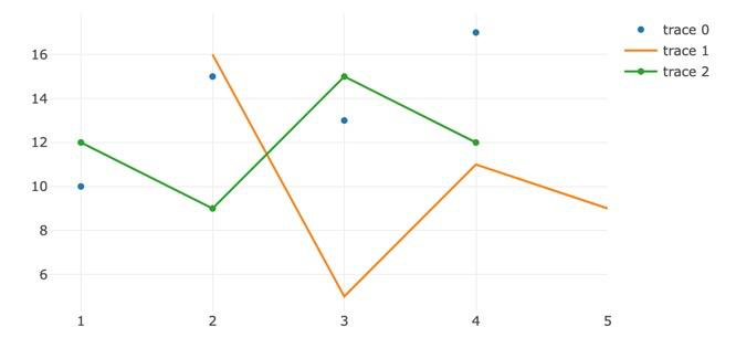
You can see the blue dots of trace0, which uses the following parameters:
// Plotly parameters
mode: ‘markers’, // show as dots
type: ‘scatter’
The orange line is trace1 and shows a line but no dots:
mode: ‘lines’,
type: ‘scatter’
And the line with dots on it is trace2:
mode: ‘lines+markers’, // show as lines and dots
type: ‘scatter’
The final lines of the script assemble the data array, then plot the chart to the <div> in HTML:
//create the data array
const data = [trace0, trace1, trace2];
_// Call Plotly to output to
<chartdiv> in HTML file _**Plotly**.**newPlot**(**‘chartDiv’**, **_data_**);</chartdiv>
That’s it!
Open your index.html page in a browser and see the result.
Note that you can hover your cursor over the plot points to see information and values.
Congrats!
Create Histograms with Plotly.js
The basic process you saw with the scatter plot is used for just about all of Plotly’s charts. Let’s make some histograms using various parameters to enhance your data visualization.
Edit the index.html file
Start with your “index.html” file, and edit the title in the <head> and the script name before the </body> tag.
<!DOCTYPE html>
<html lang="en">
<head>
<meta charset="UTF-8">
<title>Histogram Basic</title>
<!-- Load plotly.js using CDN -->
<script src='https://cdn.plot.ly/plotly-2.16.1.min.js'></script>
</head>
<body>
<div id='chartDiv'><!-- Chart Placeholder --></div>
<script src=‘histogramBasic.js'></script>
</body>
</html>
Create the “histogramBasic.js” file
Here is the entire histogramBasic.js script:
// Begin script
// Generate raw data array
let x = [];
for (let i = 0; i < 500; i ++) {
x[i] = Math.random();
}
const trace = {
x: x,
type: 'histogram',
marker: {
color: 'green', // using color parameter
},
};
const layout = {
title: 'Basic Histogram with Color' // Gives chart layout a title
};
const data = [trace];
Plotly.newPlot('chartDiv', data, layout);
// End script
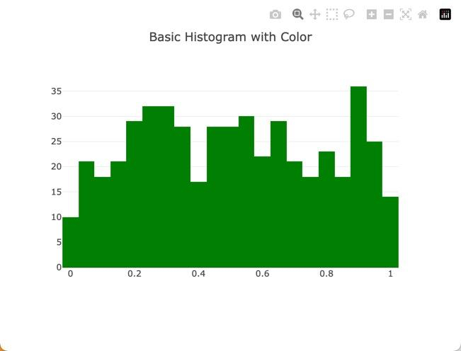
- Things to see in this script:
- The type is changed to “histogram”
- The marker entry uses the “color” parameter. Colors can use CSS color names or RGB values (‘rgb(17, 157, 255)’)
- The “layout” const is added, with the parameter “title”
- Invoking Plotly uses the const variables in the newPlot parameters
Use overlays in your Plotly chart
To compare data sets, you may overlay graphs. Here is the script to do just that:
// Begin script
// Generate raw data
const x1 = [];
const x2 = [];
for (let i = 1; i < 500; i++)
{
// let k = Math.random();
x1.push(Math.random() + 1);
x2.push(Math.random() + 1.1);
}
const trace1 = {
x: x1,
type: "histogram",
opacity: 0.5, // opacity ranges from 0 to 1
marker: {
color: 'blue',
},
};
const trace2 = {
x: x2,
type: "histogram",
opacity: 0.6,
marker: {
color: 'pink',
},
};
const data = [trace1, trace2];
const layout = {barmode: "overlay"};
Plotly.newPlot('chartDiv', data, layout);
// End script
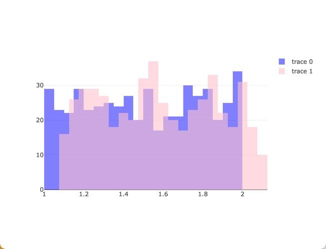
Don’t forget to update the <script> tag at the bottom to \‘histogramOverlay\’ !!!
Add responsiveness to your Plotly chart
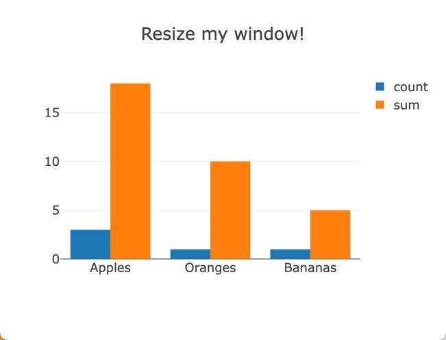
You may have noticed that the charts you’ve generated are not responsive—they will not resize when the browser window resizes. Let’s fix that now.
//Begin script
// Generate raw data
const x = ["Apples","Apples","Apples","Oranges", "Bananas"]
const y = ["5","10","3","10","5"]
const data = [
{
histfunc: "count", // "count" | "sum" | "avg" | "min" | "max"
y: y,
x: x,
type: "histogram",
name: "count"
},
{
histfunc: "sum",
y: y,
x: x,
type: "histogram",
name: "sum"
}
]
const layout = {
title: 'Resize my window!',
font: {size: 18}
};
// make the chart change size with window resize
const config = {responsive: true}
Plotly.newPlot('chartDiv', data, layout, config ); // add config const
// End script
Plotly.js References and Documentation
A few things should be clear by now:
- Plotly is very flexible
- Plotly, with a little practice, is easy to use
- Plotly, with over 40 chart types, 3D, animation, etc., is complex
We’ve only touched the surface of what Plotly can do, and only in JavaScript.
For a great one-page reference of Plotly.js commands and parameters, visit https://plotly.com/javascript/reference/.
The home page for complete Plotly.js documentation, including a quick reference and links to all the various chart types, is at https://plotly.com/javascript/.
Next steps
Tiiny.host is the easiest way to share your static HTML pages, images, and—of course—your Plotly charts.
Visit Tiiny.host’s homepage for a quick three-click upload procedure. You can upload and host your charts, pdfs, graphics, and static HTML sites for free.
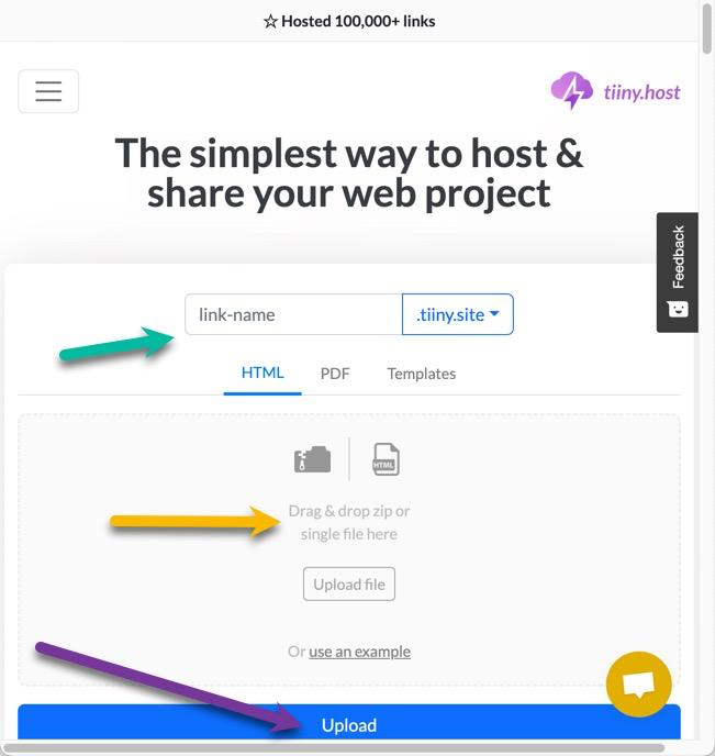
- Provide the link-name for your web project’s URL.
- Drag and Drop or upload your zipped Plotly index.html and script files.
- Click the big blue “Upload” button.
That’s it!
With Tiiny.host pro accounts, you can password-protect your documents, see your visitor statistics, and more.
Tiiny.host’s customer service is awesome! Contact support directly through chat or email at Tiiny.host/help.


