A strong website portfolio is a must for any freelancer starting their journey in 2021. The Web Dev space is very competitive and the best way to win more business is with a well-designed, compelling portfolio website that will:
- Build your unique brand and reputation
- Highlight your past projects
- Educate your clients on your process and the type of work you do
A countless number of drag ‘n drop portfolio builders like Contently, Behance, and Squarespace will build a website for you, but if you’re looking for something custom, then this tutorial is for you.
In this tutorial, we will learn how to plan, build, and deploy a web developer portfolio website for your freelance business using HTML and Bootstrap.
Download the full source code for the project here on Github.
Prerequisites
- Basic HTML/CSS
- Bootstrap 5
What we’ll be making
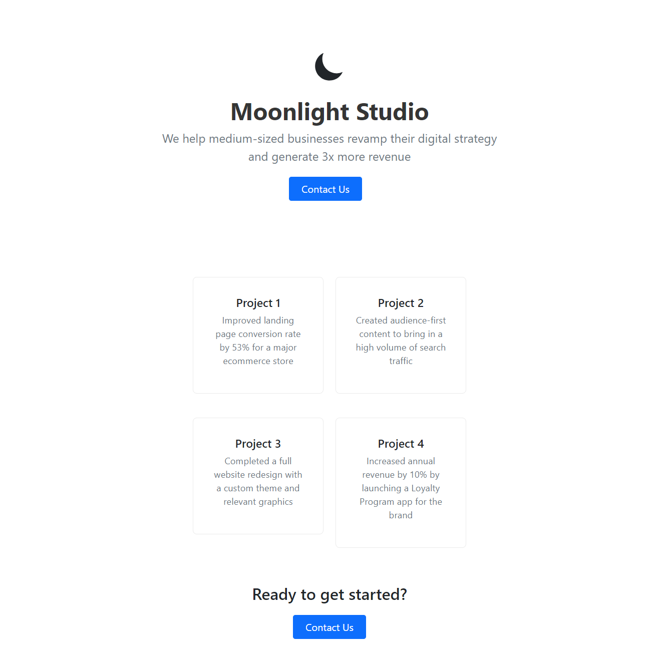
Here’s a screenshot of what we will accomplish by the end of this tutorial: a responsive, modern website with a direct call-to-action that is perfect for your freelancing business.
You can also view the live demo here.

Plan out your website
Before we jump into code, let’s do some prep work and figure out what exactly we need to add to our website. A well laid out content plan will make our life much easier. Here’s a list of what we will need:
- Brand Name: The name of your agency/freelance business
- Primary Color: Decide on the main color for your brand - you only need one
- Past Projects: Choose at least four past projects that showcase your capabilities
- Call-To-Action: How can the visitors contact you - typically this is an email address
To make things easier, we set up a Google Docs for you to fill out here.
With the prep work finished, let’s move on to the fun part. Coding!
Set up a new HTML project
First, we will start a new HTML project and add Bootstrap 5 libraries to it. Create a new folder called freelance-website and add a file named index.html.
<!DOCTYPE html>
<html lang="en">
   <head>
      <meta charset="utf-8" />
      <meta name="viewport" content="width=device-width, initial-scale=1" />
      <link
         href="https://cdn.jsdelivr.net/npm/bootstrap@5.0.0/dist/css/bootstrap.min.css"
         rel="stylesheet"
         integrity="sha384-wEmeIV1mKuiNpC+IOBjI7aAzPcEZeedi5yW5f2yOq55WWLwNGmvvx4Um1vskeMj0"
         crossorigin="anonymous"
         />
      <title>Moonlight Studio</title>
      <style></style>
   </head>
   <body>
      <div class="container">
         <h1>Hello World</h1>
      </div>
      <script
         src="https://cdn.jsdelivr.net/npm/bootstrap@5.0.0/dist/js/bootstrap.bundle.min.js"
         integrity="sha384-p34f1UUtsS3wqzfto5wAAmdvj+osOnFyQFpp4Ua3gs/ZVWx6oOypYoCJhGGScy+8"
         crossorigin="anonymous"
         ></script>
   </body>
</html>
Bootstrap makes it easier for us to design a responsive website that looks good on all screen sizes and devices. It provides us with a basic layout and styling that we can then build on. Learn more about how Bootstrap works here.
To accomplish this, import the necessary Bootstrap CSS and JS files. Once these are loaded into the page, add content into the body tag.
Notice the empty style tag in the head. We will use this to add custom styles as we move forward.
The most basic layout class is the container class. All of our content falls into the container. For now, we will keep it simple and add a Hello World heading.
Open up the index.html in any browser and you should see a Hello World on the screen.
Perfect. Our base project is now set up. Let’s keep going!
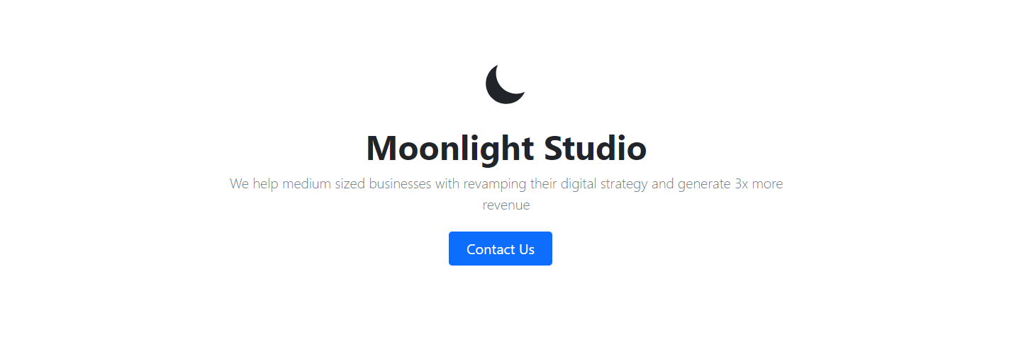
Add the Hero Section
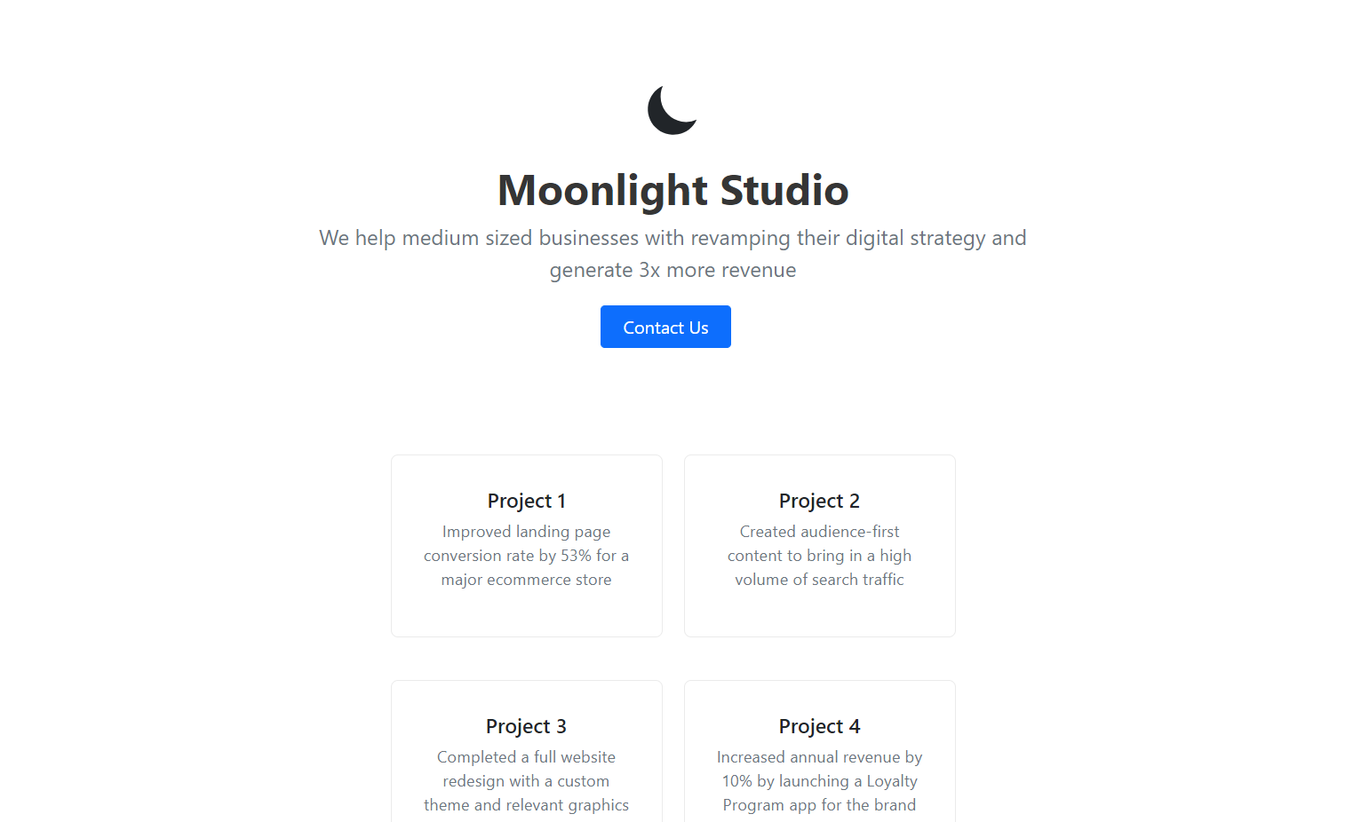
The Hero section is the topmost section of our website. It contains the Brand Logo, Brand Name, Tagline, and Primary CTA.
In the container tag, add a row div that signifies a new section on our page.
First things first, we need a logo. I am using one of the free icons from the heroicons library, but you can use your own if you like.
<div class="container">
   <div class="row">
      <div class="col-lg-8 mx-auto">
         <div class="px-4 py-5 my-5 text-center">
            <div class="d-block mx-auto mb-4" style="width: 72px">
               <svg
                  xmlns="https://www.w3.org/2000/svg"
                  class="h-5 w-5"
                  viewBox="0 0 20 20"
                  fill="currentColor"
                  >
                  <path
                     d="M17.293 13.293A8 8 0 016.707 2.707a8.001 8.001 0 1010.586 10.586z"
                     />
               </svg>
            </div>
         </div>
      </div>
   </div>
</div>
We can add an h1 heading for the title and a p tag for the tagline. Let’s make the title bold so it stands out.
<h1 class="display-5 fw-bold">Moonlight Studio</h1>
<p class="lead mb-4 text-muted">
   We help medium sized businesses with revamping their digital
   strategy and generate 3x more revenue
</p>
The CTA button in the Hero section must be prominent enough to naturally guide the visitor’s attention to it so they can take action. Bootstrap has btn-primary and btn-lg classes that we can use here to style our CTA button.
Since we want the customer to email us when they press the button, we can use the onclick attribute of the HTML button. This will trigger the mail app to open and autofill the email address in with the mailto address.
<div class="d-grid gap-2 d-sm-flex justify-content-sm-center">
   <button
      type="button"
      class="btn btn-primary btn-lg px-4 me-sm-3"
      onclick="location.href='mailto:xyz@abc.com'"
      >
   Contact Us
   </button>
</div>
The completed Hero section looks like this:
<div class="container">
   <div class="row">
      <div class="col-lg-8 mx-auto">
         <div class="px-4 py-5 my-5 text-center">
            <div class="d-block mx-auto mb-4" style="width: 72px">
               <svg
                  xmlns="https://www.w3.org/2000/svg"
                  class="h-5 w-5"
                  viewBox="0 0 20 20"
                  fill="currentColor"
                  >
                  <path
                     d="M17.293 13.293A8 8 0 016.707 2.707a8.001 8.001 0 1010.586 10.586z"
                     />
               </svg>
            </div>
            <h1 class="display-5 fw-bold">Moonlight Studio</h1>
            <p class="lead mb-4 text-muted">
               We help medium sized businesses with revamping their digital
               strategy and generate 3x more revenue
            </p>
            <div class="d-grid gap-2 d-sm-flex justify-content-sm-center">
               <button
                  type="button"
                  class="btn btn-primary btn-lg px-4 me-sm-3"
                  onclick="location.href='mailto:xyz@abc.com'"
                  >
               Contact Us
               </button>
            </div>
         </div>
      </div>
   </div>
</div>
We can add some custom styling to make the header look more balanced. In the style tag of the head, add:
<style>
   h1, p {
   color: #353535;
   }

   p {
   font-size: 1.15rem;
   }

   .lead {
   font-size: 1.5rem;
   font-weight: 400;
   }
</style>
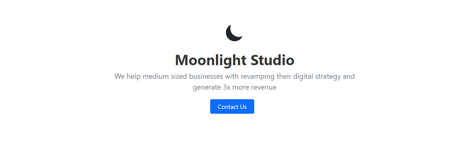
Much better!
Add Projects
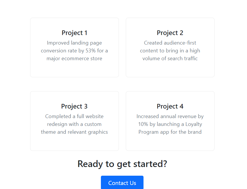
The next section is Projects. This is where you can showcase your past projects and highlight your results.
To do this, let’s build a standard card template that we can duplicate later on.
<div class="content-card" style="text-align: center">
   <h2>Project 1</h2>
   <p class="text-muted">
      Improved landing page conversion rate by 53% for a major ecommerce
      store
   </p>
</div>
We can now add this content-card four times in a row in the body tag.
Notice that the first content card is offset so they look centered in the page.
<div class="container">
   ...
   <div class="row">
      <div class="col-lg-3 offset-lg-3">
         <div class="content-card" style="text-align: center">
            <h2>Project 1</h2>
            <p class="text-muted">
               Improved landing page conversion rate by 53% for a major ecommerce
               store
            </p>
         </div>
      </div>
      <div class="col-lg-3">
         <div class="content-card" style="text-align: center">
            <h2>Project 2</h2>
            <p class="text-muted">
               Created audience-first content to bring in a high volume of search
               traffic
            </p>
         </div>
      </div>
      <div class="col-lg-3 offset-lg-3">
         <div class="content-card" style="text-align: center">
            <h2>Project 3</h2>
            <p class="text-muted">
               Completed a full website redesign with a custom theme and relevant
               graphics
            </p>
         </div>
      </div>
      <div class="col-lg-3">
         <div class="content-card" style="text-align: center">
            <h2>Project 4</h2>
            <p class="text-muted">
               Increased annual revenue by 10% by launching a Loyalty Program app
               for the brand
            </p>
         </div>
      </div>
   </div>
</div>
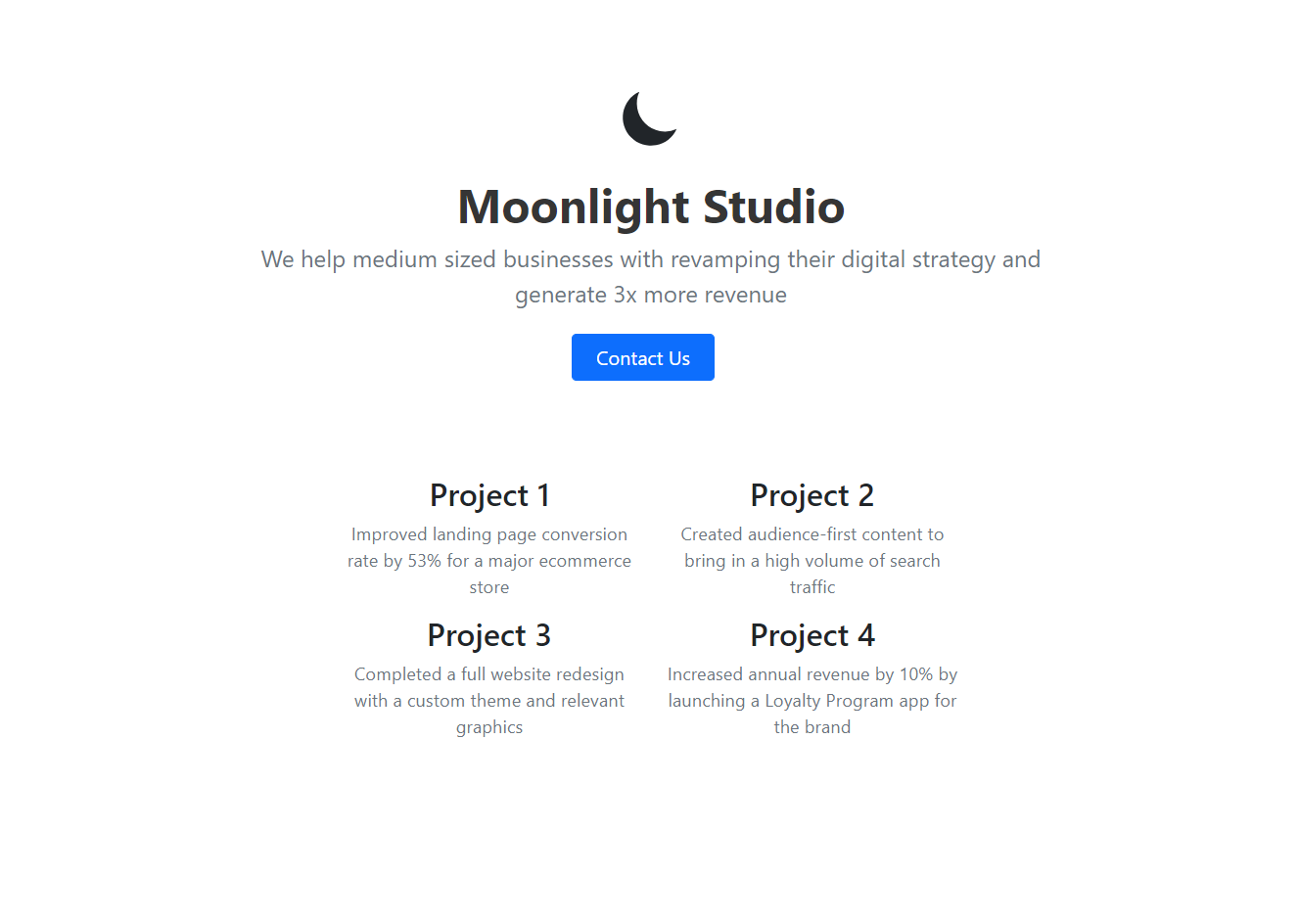
The content cards can use a bit of styling. We can do this by adding onto our style tag:
<style>
   ...

   .content-card {
   border: 0.0625rem solid #ebebeb;
   border-radius: 0.5rem;
   padding: 2.25rem;
   margin: 1.5rem 0;
   }

   .content-card h2 {
   font-size: 1.4375rem;
   }
</style>
Great - that looks much more cohesive now!
Add a Secondary CTA
The last section we need is a Secondary CTA that will remind our visitor to take action. We can use a simple button that opens the mail client just like we did before in the Primary CTA.
Let’s add another row in the container div.
<div class="row">
   <div class="col-lg-6 mx-auto" style="text-align: center">
      <h2 class="mb-4">Ready to get started?</h2>
      <div class="d-grid gap-2 d-sm-flex justify-content-sm-center">
         <button type="button" class="btn btn-primary btn-lg px-4" onclick="location.href='mailto:xyz@abc.com'">
         Contact Us
         </button>
      </div>
   </div>
</div>
The Secondary CTA looks really good. There’s a small issue with the spacing - it’s too close to the bottom. We can fix this easily by adding to the styles:
<style>
   ...

   .row {
   margin-bottom: 2rem;
   }
</style>
And there we have it. Now we can deploy our website.
Deploy using tiiny.host
Here’s how we can deploy our website to tiiny.host:
- Zip your
index.htmlfile - Navigate to tiiny.host
- Drag and drop the zip file
- Enter your subdomain - this can be anything
-
Press Launch
That’s it! Your freelance website is up and ready to go.
Download the full source code for the project at https://github.com/tiinyhost/guides/tree/main/simple-freelance-website
Final Thoughts
In this tutorial, we learned how to plan, build, and deploy a web developer portfolio website for your freelance business using just HTML and Bootstrap. You can extend this website by :
- Further adding custom styling and content
- Adding analytics to see who is visiting
- Introducing social proof with client testimonials
Cheers!

