- What is Flourish Studio?
- Why Flourish Studio above all?
- What is the best way to use Flourish Studio?
- What are the pros and cons of Flourish Studio?
- So, Flourish Studio is your visualization tool!
Beautiful visualizations are advancing the digital world day by day. Today, visualizations are important to help you stand out. Visualizations play a great role in capturing the audience’s attention and developing their keen interest in the content.
The good news is that there are tools that can make visualizations easier to create, more accessible, and more shareable. What’s more is that they can help you tell stories with all kinds of data, across all kinds of devices.
In this article, we’ve composed a complete guide on how you can use flourish to improve your work.
Creating beautiful HTML visualizations with Flourish Studio can help you achieve your requirements. We recommend Flourish to produce the best visualizations and help you stand out among thousands of visualizations.
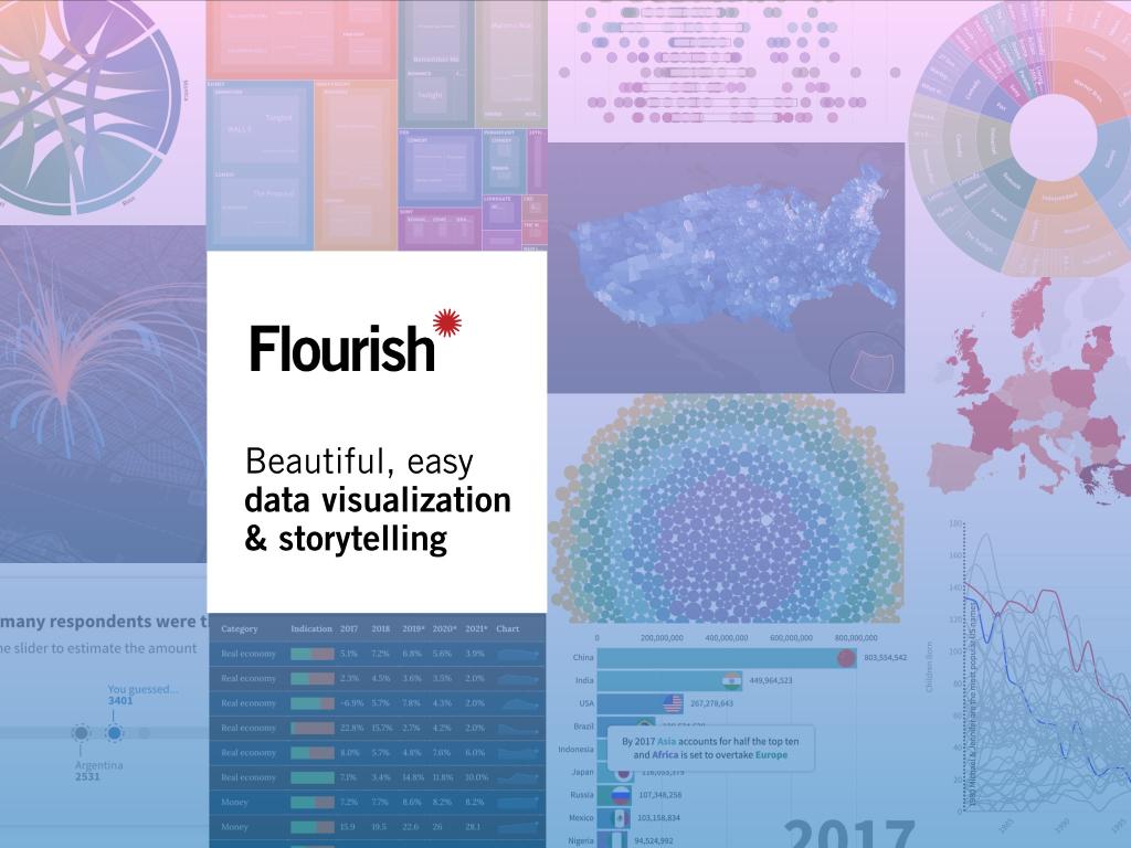
What is Flourish Studio?
Flourish is an incredible tool. It has a good selection of standard charts, as well as some additional animation on loading and handy interactivity. There are some great built-in color ranges to choose from, as well as the possibility to build your own. There’s also a good deal of customization in Flourish. These benefits help in making visualizations more effective and impactful.
Flourish particularly sets itself apart from other tools as it provides several charts that you won’t find anywhere else. You can also customize these charts within a few minutes without any hassle. This will save you time and help you get better and quicker results.
Why Flourish Studio above all?
There are many data visualization tools available but our first recommendation is Flourish. Why? It’s because when working with your data, Flourish.studio provides an online and always accessible help system to guide you through the process.
You will see an enormous question mark on the bottom right-hand side of the page. Clicking that will lead you to a database of hints, tips, and tricks.
What is the best way to use Flourish Studio?
Flourish.studio enables you to register your account. By registering on Flourish. You will be provided with a lot of authority over how you create and store your visualizations.
When you first log in to Flourish.studio, you’ll see a little menu with the following options:
1. My Projects
2. New Visualization
3. New Story
From this menu, you may create either a single visualization (of which there are many) or a series of visualizations that are grouped to tell a data-driven story.
This is your dashboard, so if you’ve already created visualizations, they’ll appear here as well.
When you go to flourish.studio’s site (https://flourish.studio), you will be presented with a very extensive visual gallery of the visualization templates that it has available. This can be intimidating or confusing for beginners. It is important that you have some sense of the sort of way you would like to visualize your dataset.
The creators of Flourish.studio have chosen a visualization-first approach. Visualizations make demo data easy to find and share. It shows you how data should be formatted.
This is a great tool for showing what your final HTML visualizations will look like. So if you’re tense about the final outcome of your visualization, then don’t worry. You will be provided with a preview so you can have a better idea of your results.
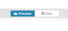
There are many different options available on this screen to adjust the visualization. You can go into a lot of different settings such as how much information is shown, how the data is displayed, and the way it looks. When making changes to the parameters, the visualization immediately reflects those changes.
To upload your data, you must select the data tab at the top.
On the data panel, you may make manual changes to your data or upload it in a variety of formats. It’s worth noting that this can either replace or supplement the information already in the online file. The data you provide will be formatted differently depending on the type of visualization you’re making.
For instance, flourish.studio will accept a geoJSON file that may be used to create cartographic primitives and they can be visualized.
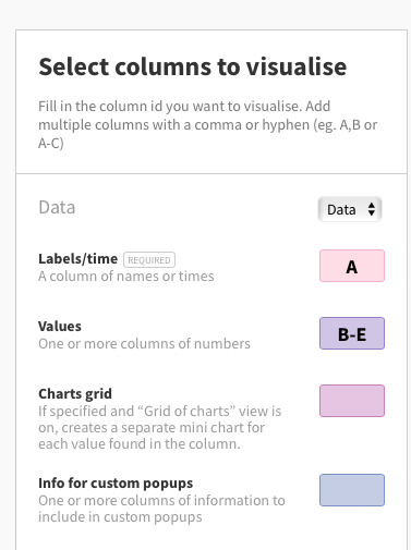
When data is present in the data table, you can select which columns should be seen on the right-hand screen. Any adjustments you make will be seen in the preview below your options.
Once you’ve received your desired designs, the final step in the process is to share the visualization. The “Export & publish” button allows you to share your work. Sharing your work with others will also help you take suggestions and recommendations for modifying your designs further.
What are the pros and cons of Flourish Studio?
PROS:
- There are many templates for the users to start creating their visualizations.
- It easily creates attractive and exclusive visualizations.
- You can also generate maps and moving globes with Flourish Studio.
- Flourish processes the result within a few minutes.
- It is user-friendly and very helpful for beginners.
CONS:
- The main problem is you will have to find your data first.
- The free version of the tool is quite limited as compared to the paid version offerings.
So, Flourish Studio is your visualization tool!
Flourish.studio enables you to store the visualization in static image files. You can use them on-screen or in print, or to integrate the visualization into your blog or other online sources with interactive components.
Flourish.studio builds embedded code to insert into your HTML source as well as a single URL to share your built-in visualization with other members of your team.
